Bull’s Snack Sticks | Bullfighter Meat
Bright & modern point of sale design for a jerky brand.
From Bull’s to Bullfighter
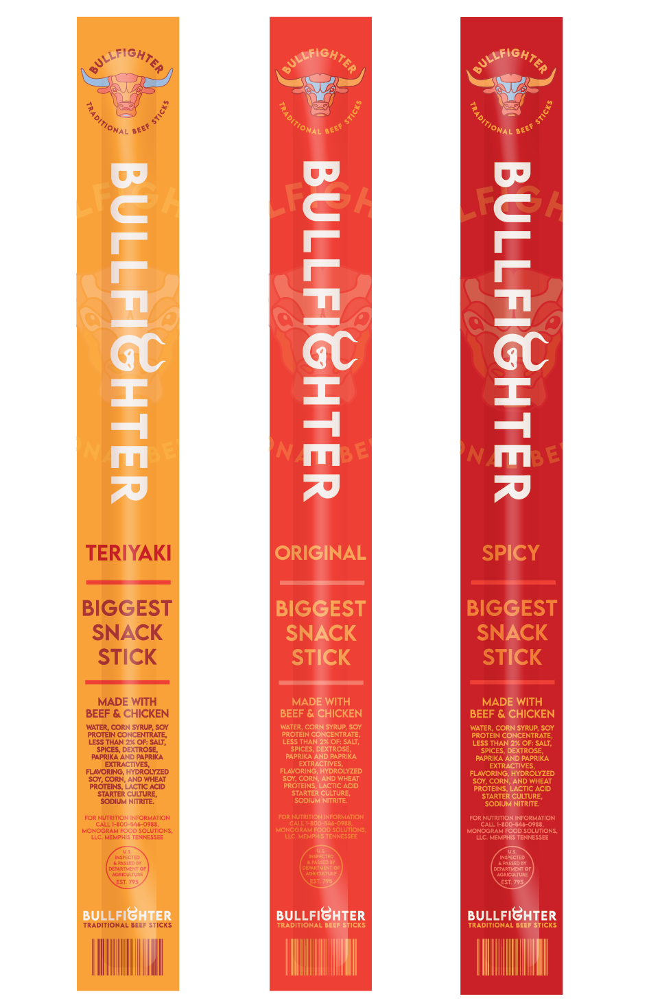
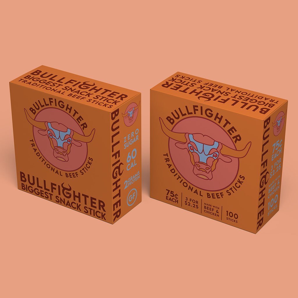
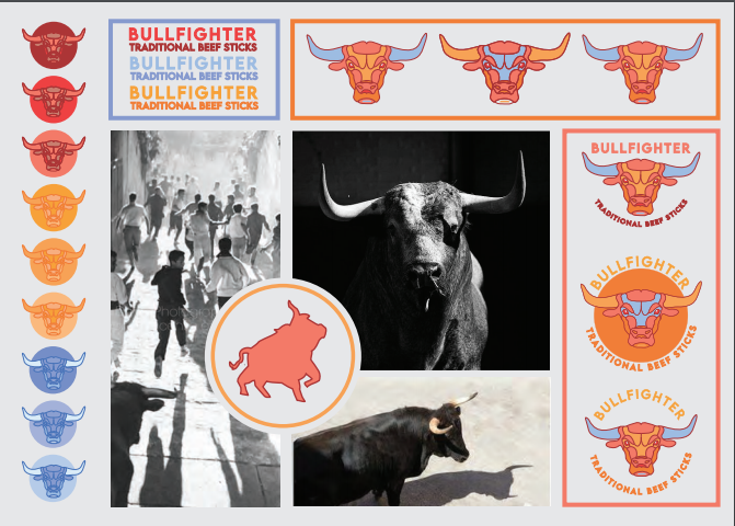
Bull’s Meat Sticks are a great product with a generic packaging much too similar to industry leader, Slim Jim’s. The assignment was to update the Bull’s brand, beef stick packaging, as well as their point of sale exhibit. Below is one of two different concepts for the Bull’s rebrand; this being a modern, bright rebrand, both concepts renamed: Bullfighter.
This concept focuses on a modern appearance to standout amongst other protein snacks. This look has a very graphic, color blocking theme to it, much different than anything else
on the shelf.

The brief
Bull’s Meat Sticks are a quality meat snack with a lackluster identity. The yellows & reds draw an obvious comparison to industry titan, Slim Jims. The current packaging not only fails to differentiate from other competitors but fails to inform the customer of any of its flavors or benefits. An rebrand of their identity is needed, with the option to rename, as well as redesign their packaging for individual meat snacks & point of sale containers.
New brand identity
Name update
Packaging design for jerky sticks
Point of sale exhibit design


